Project Type
Publication design, AI generated design
Target Audience
Businesses of all sizes
Timeframe
3 Weeks
Problem
Businesses often face challenges in understanding evolving salary trends and hiring patterns, which can hinder their ability to make informed, data-driven decisions. Existing customers need fresh, insightful data to stay competitive, while new customers seek robust research tools to understand market dynamics. Without comprehensive analysis, companies may struggle to align their strategies with current corporate landscape trends.
Objectives
The objective of this project is to deliver an in-depth, data-driven report that reveals new trends and patterns in payment and hiring practices. The second edition of "SHOW ME THE MONEY" aims to provide existing customers with valuable insights to refine their strategies and offer new customers a detailed research tool to guide their decision-making. The project also includes designing engaging assets to support the report’s go-to-market strategy, ensuring the findings are effectively communicated and utilized.
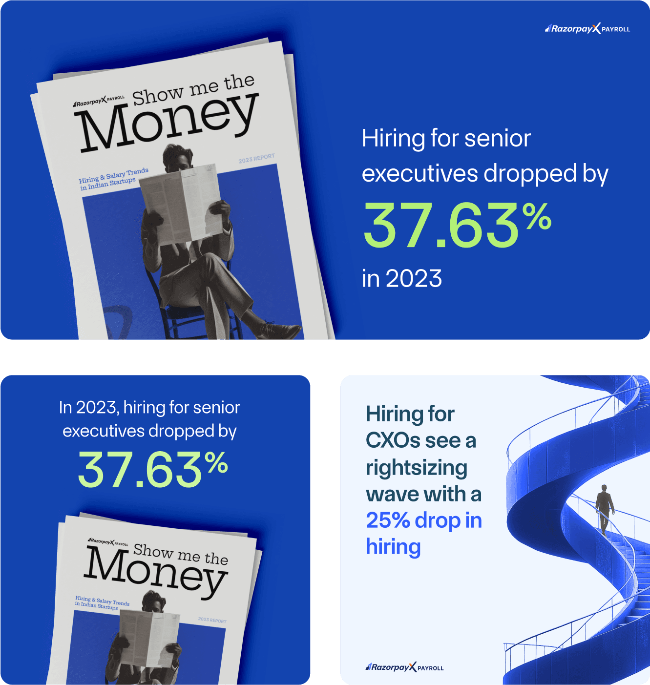
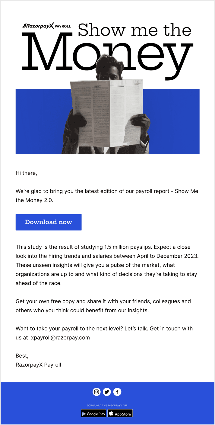
GTM Collaterals
Roles & Responsibilities
As the lead designer on the project, I spearheaded the project from concept to execution.
Design approach
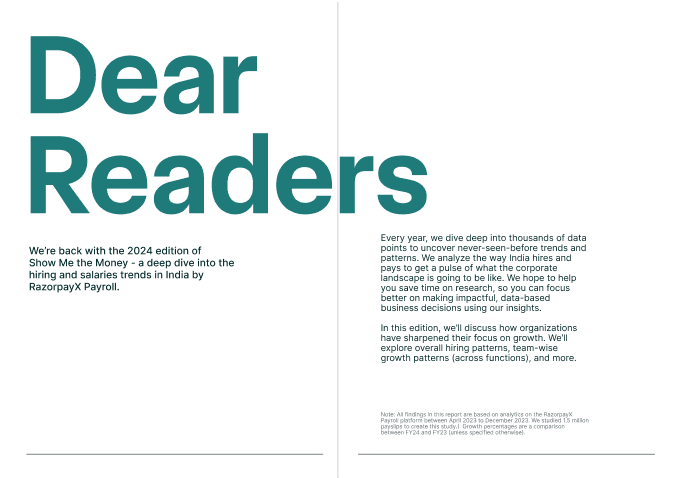
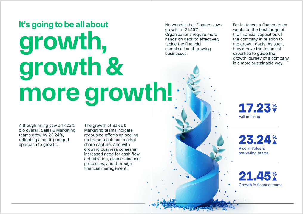
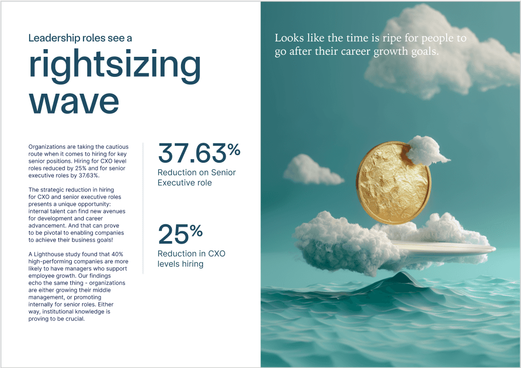
The marketing team collated the data that we received from 30,000 employees across 20 sectors. Once this information was shared, it was my responsibility to create a report. The key objectives of the design were:
Modern Design with Growth Focus
Create a design that reflects the theme of growth and is visually engaging, making readers excited to explore the content.
Simplify Complex Information
Present intricate data and trends in a format that is easy to understand and visually appealing.
Enhance Customer Engagement
Deliver a report that not only delights existing customers but also serves as an effective research tool for new clients, helping them navigate salary trends and hiring patterns.
Typography & layout explorations
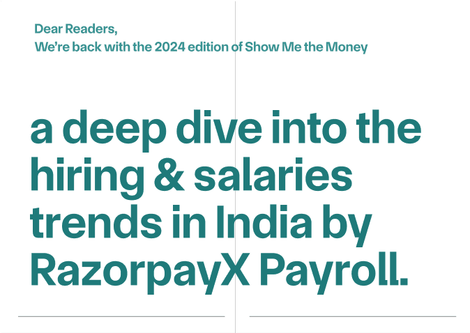
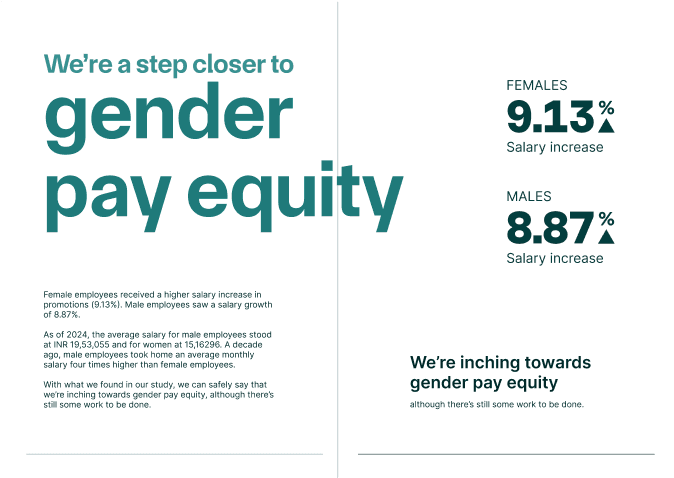
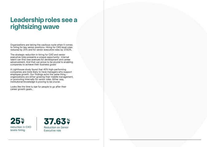
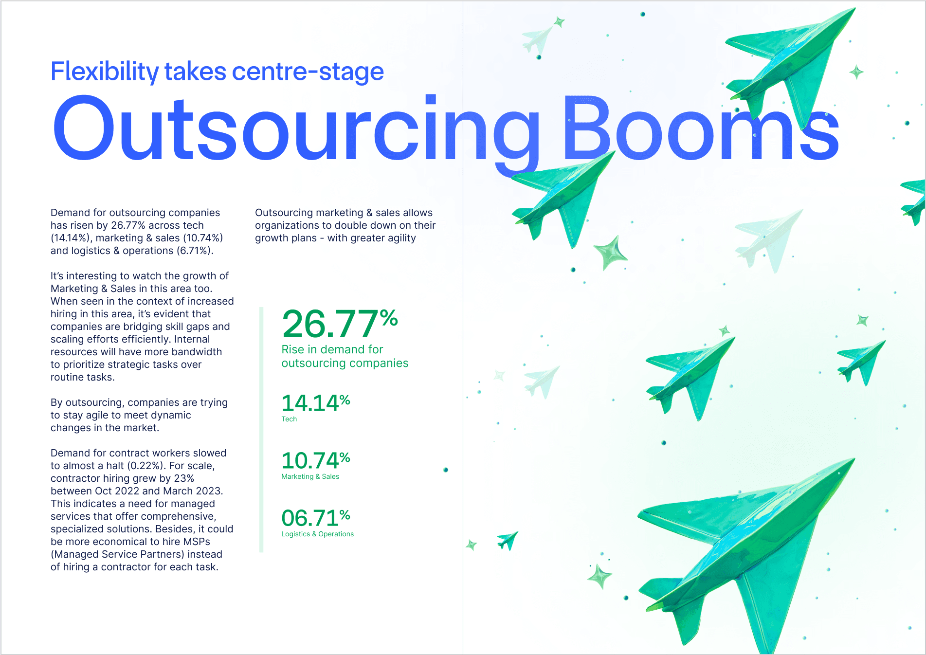
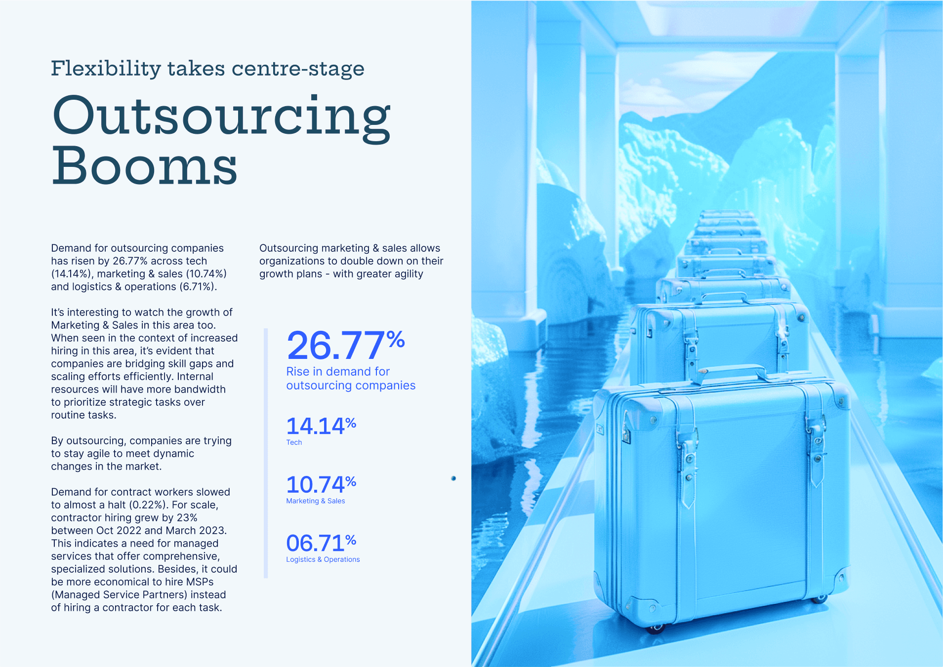
I experimented with various layout structures and typesettings to find the most effective way to present the data. This involved creating multiple iterations to refine the layout for clarity and visual appeal.
Visual Style Exploration
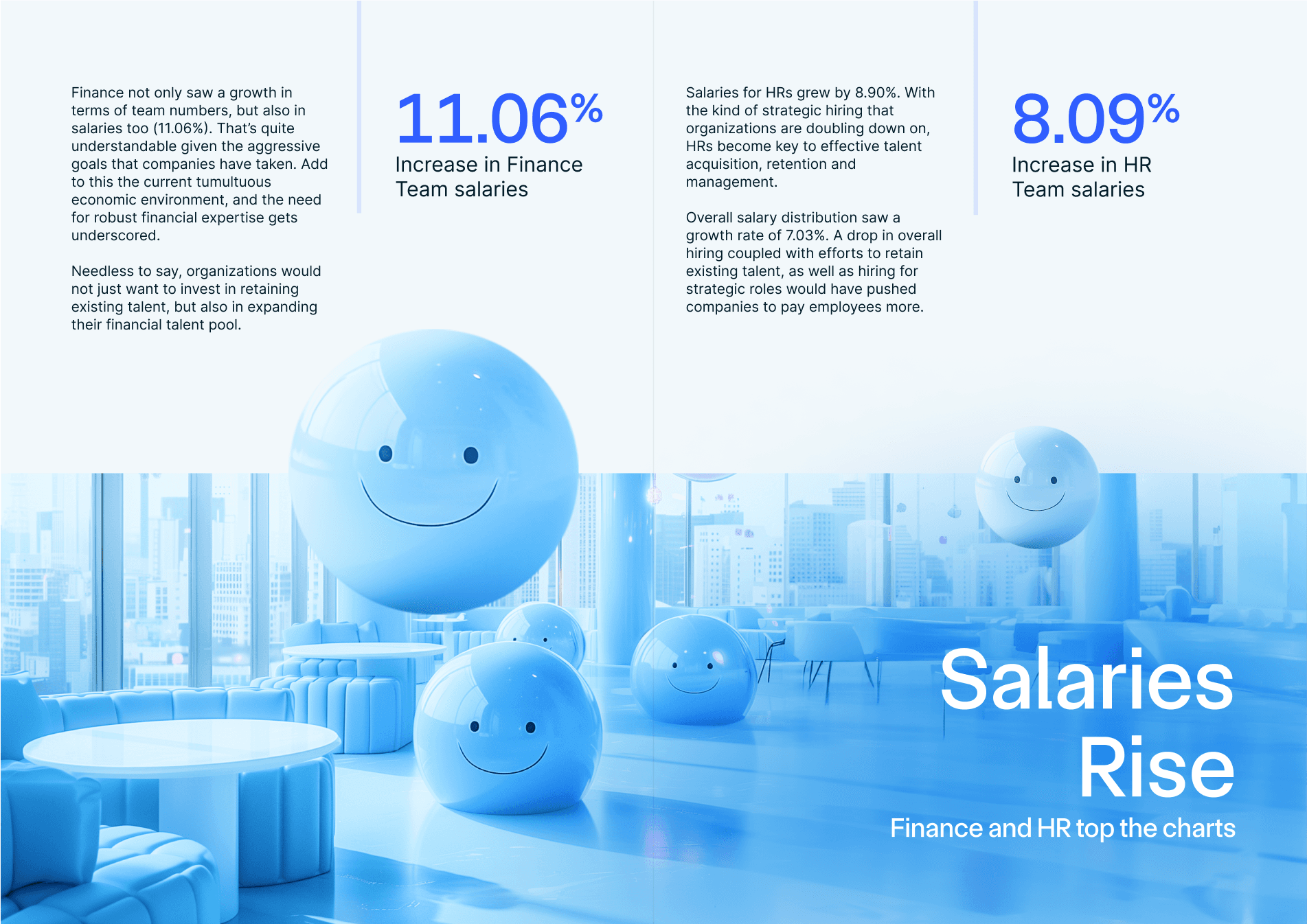
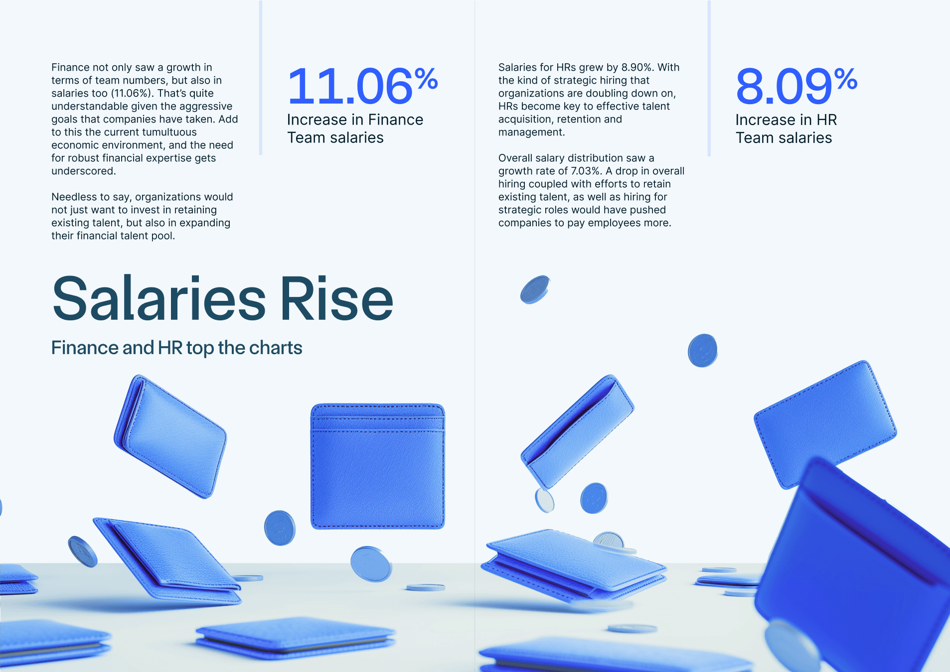
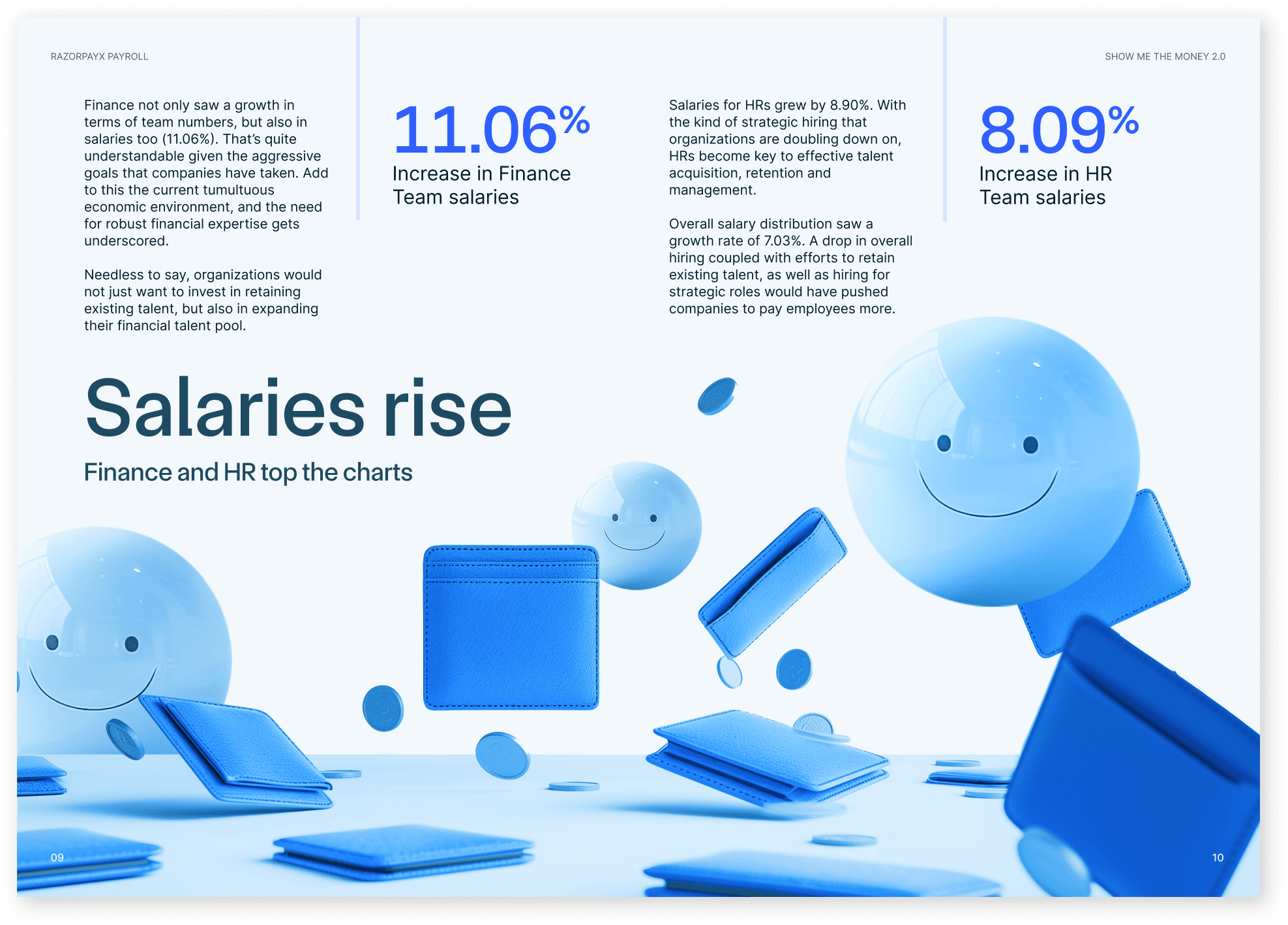
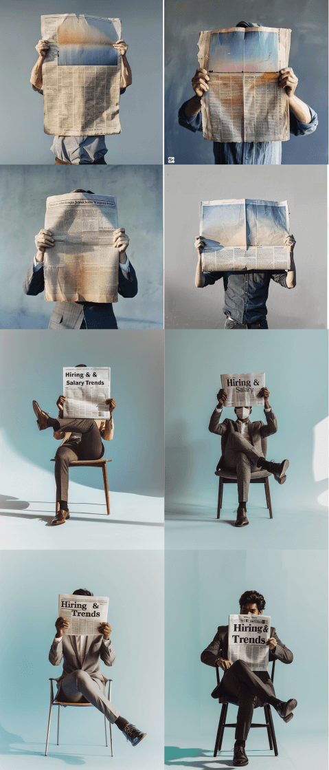
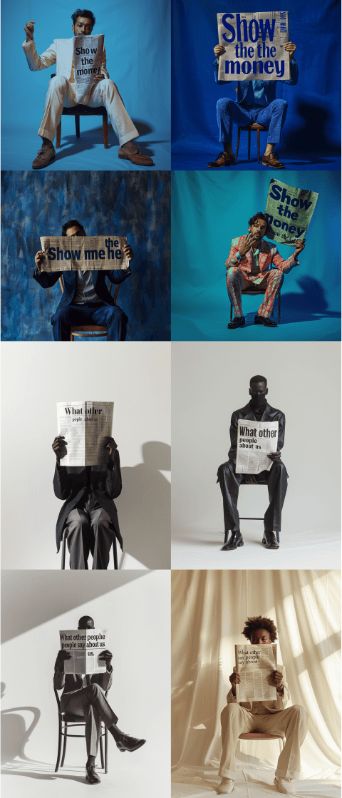
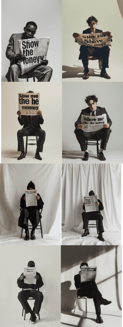
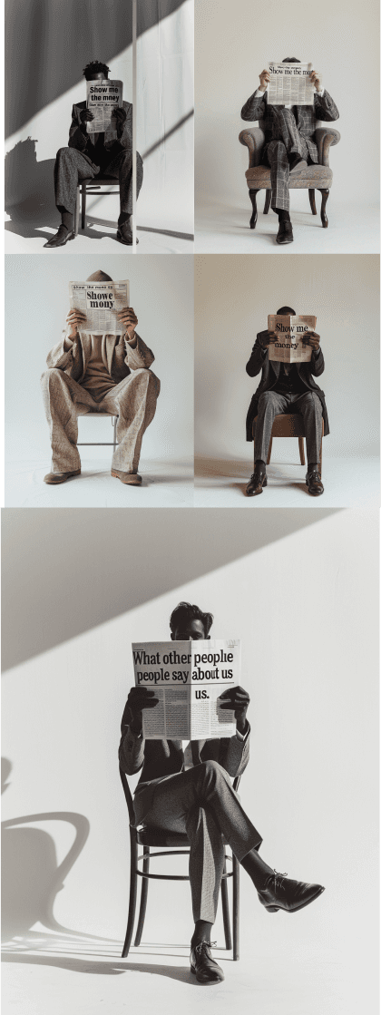
Style Experimentation: To best showcase the data, I explored several visual styles including 3D effects, paper cutouts, and human imagery. Each style was evaluated for its ability to enhance data presentation and engage readers.
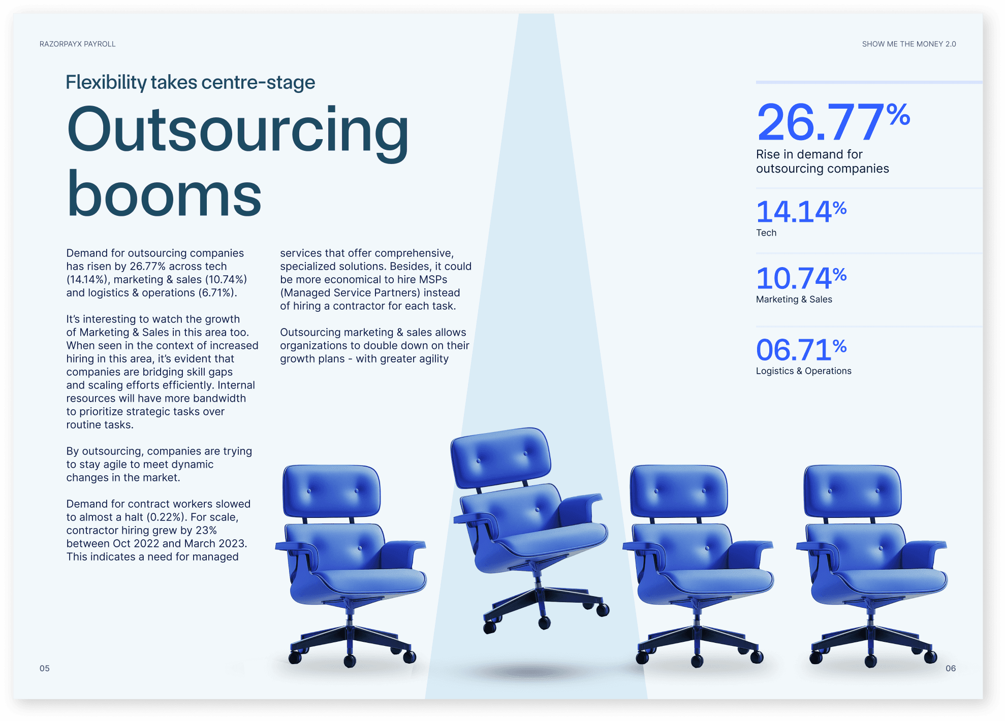
Final Style Choice: After thorough experimentation, I settled on a visual style that blended modern aesthetics with clear data representation, ensuring the report was both attractive and informative.
The process involved constant reiteration to ensure that all spreads were, interesting and contextual to the report
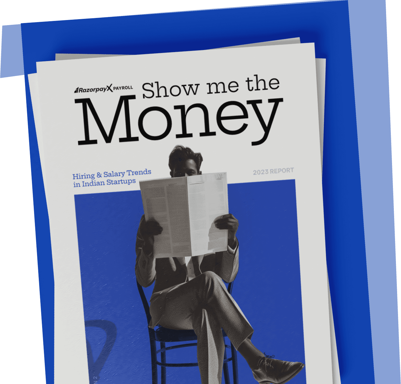
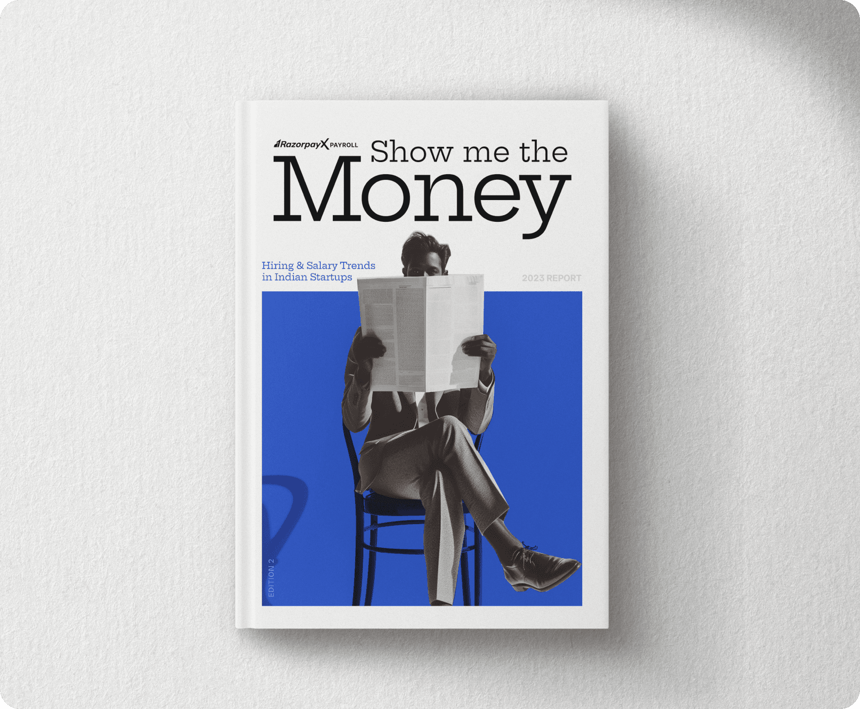
Cover Design
The cover was designed to be eye-catching & professional, setting the tone for the report. It needed to reflect the high-quality content and sophisticated design while drawing readers in.
The final report was designed to strike a balance between maturity and delight. The text was kept concise and impactful, and illustrations were rendered using Midjourney and then fine-tuned in Photoshop.
The Team
Delivering high-class output and seeing them to success would not be possible as a one woman team. This project was a collaborative effort involving the marketing, design teams.
While I led the visual aesthetics, storytelling, and project management, I worked closely with marketing stakeholders to ensure our storyline and overarching brand vision stood out. I also guided my fellow designer on the visual look and design language, ensuring all visuals looked cohesive and unified.
Outcome and Reflection
The "SHOW ME THE MONEY 2.0" report project demonstrated the power of thoughtful design in transforming complex data into an engaging and informative resource. This case study highlights the impact of effective design in delivering valuable insights and enhancing customer engagement.
By combining modern aesthetics with clear data presentation, the report not only delighted existing customers but also attracted new clients.
